Douglas Elliman Website Redesign
Redesigning experiences to better support property search and user engagement on a large luxury real estate platform.
About
Douglas Elliman is a luxury real estate company with more than 7,000 agents and 100 offices across the US.
To maintain and expand their position as an industry leader, Douglas Elliman (DE) embarked on a website redesign with the specific aims of reevaluating their heritage brand, reinventing the property search experience, and adding original, high-value sections to the site. To refine and realize these aims, DE brought on a lean team of designers (myself, another UX designer, and a lead) from thelab, a digital agency based in Brooklyn.
In partnership with DE, our team orchestrated the entirety of the discovery and wireframing phases of this effort by dividing the project into 12 tracks of work - each representing a section of the site. While I was involved with all tracks, I was ultimately responsible for crafting the vision for 5 of them; navigation, property listings, press and news, account, and agents. In addition, I led the competitive research process, created sitemaps, conducted site audits, and showcased my UI skills by driving several design tracks.
My Role
UX/UI design
UX research
Prototyping
Technical annotations
Deliverables
Sitemap
Wireframes
Design comps
Site audits
Timeline
~ 1 year
Agency
thelab
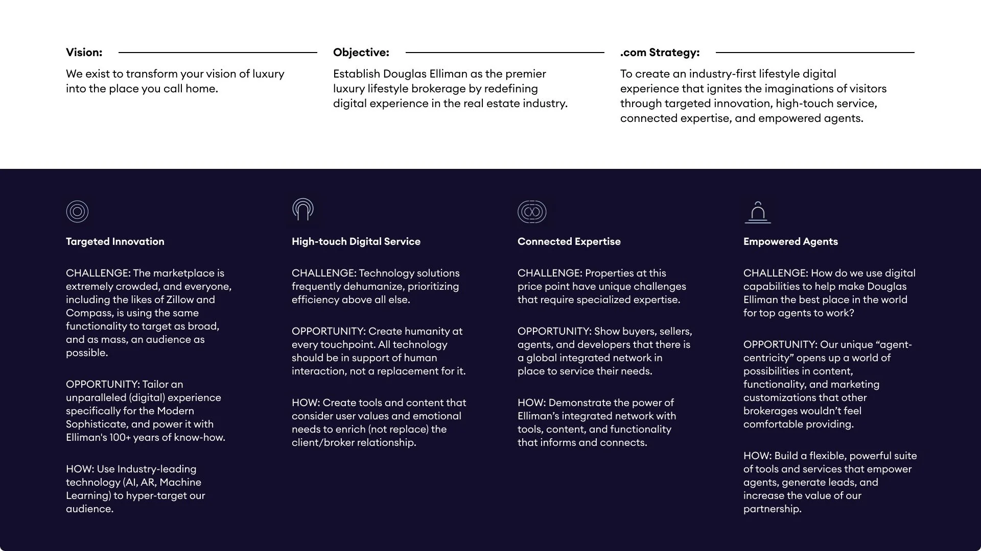
Objective
Establish Douglas Elliman as the premier luxury lifestyle brokerage by redefining their digital experience in the real estate industry.
Prior to starting this project, Douglas Elliman had not documented site experience feedback from real clients outside of comments provided directly to agents. We knew this was a crucial place to start as we needed to first understand who we were designing the site for.
Via both stakeholder and user interviews, we sought to answer the following questions: What inspires individuals when they are looking at properties? What are customers’ most important criteria when evaluating potential properties? How can we provide a top-tier experience for clients at all levels across the country?
Discovery
Exploring Perspectives
Stakeholder Interviews
A total of 12 stakeholders were interviewed, most of whom were members of Douglas Elliman’s C-suite. I did not participate in these calls, but I did review each recording and take detailed notes that informed our site audits later on in the redesign process.
Key Insights
Across the board, there is alignment on some aspects of what a luxury experience looks and feels like: personalized service, anticipation of wants and needs, and exceeding expectations.
Multiple stakeholders noted the importance of highlighting hyper-local expertise when conveying the authenticity of luxury in a specific region or market.
A majority of agents and stakeholders noted the challenge of being perceived as “only doing luxury”; it is important that we strike a balance of ultra-high-end properties with more modestly-priced listings.
User Interviews
Paired with a fellow UX designer, we conducted a total of nine user interviews to capture usability findings from the website, experiences of the buying or selling process, and feedback around the brand. For each interview, we constructed questions based on the user’s region, life stage, income, and home purchase status, asking follow-up questions for clarification or elaboration. These sessions were conducted remotely via video calls with an emphasis on both buying and selling with Douglas Elliman, regardless of whether they had completed the sale with DE or went with another agency.
Key Insights
Luxury can mean something entirely different for each person engaging with the brand. When curating recommended properties, we need to be intentional about surfacing a wider range of price points to not exclude users from exploring homes on the Douglas Elliman site.
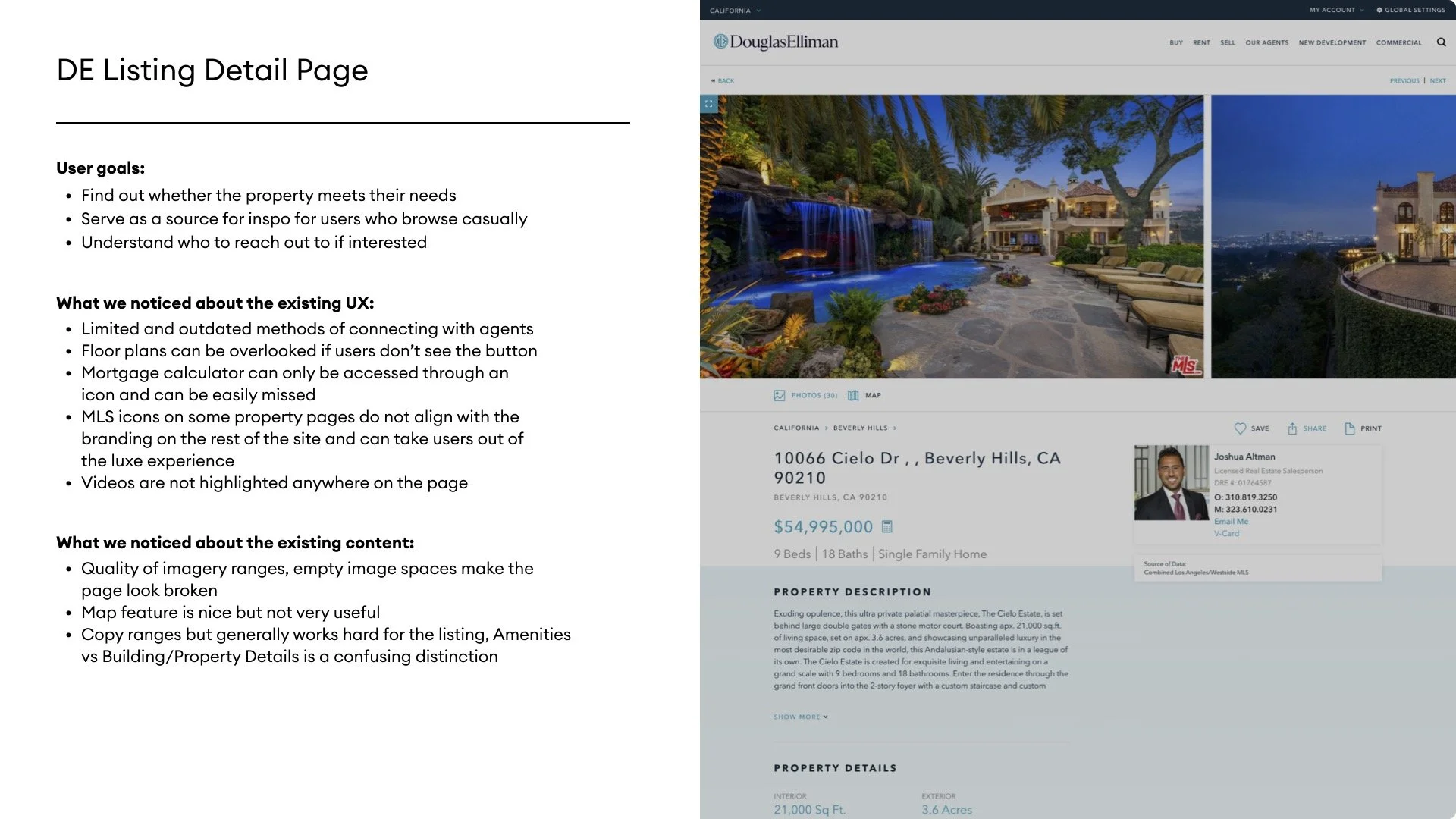
Many users mentioned the property images on listing pages as being the most important element once they were serious about their search. One user wished to see the photos enlarged and was not clear on how that could be done. Three users mentioned the floor plan visuals as being very important.
Users find extreme value in being able to organize properties they are interested in directly on the site. They have not found this capability on any competitor’s site.
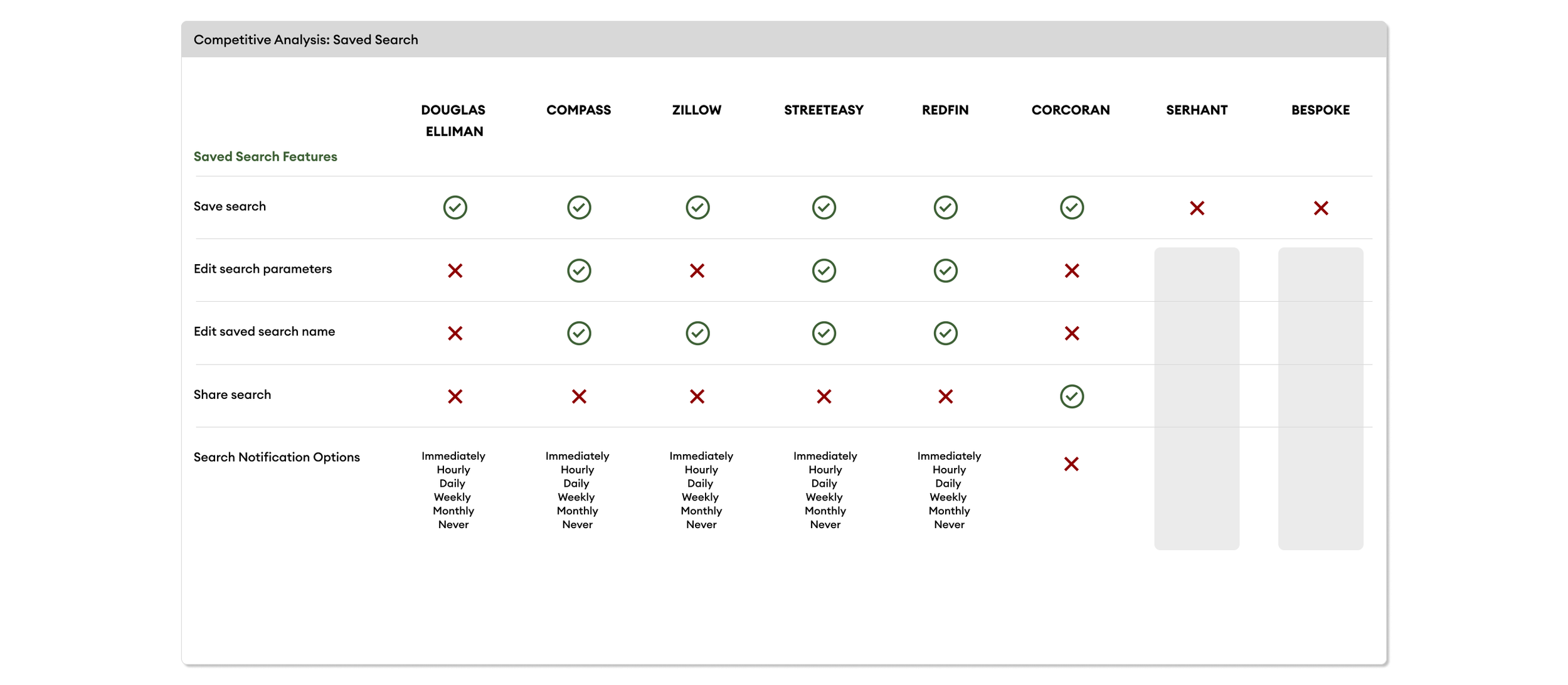
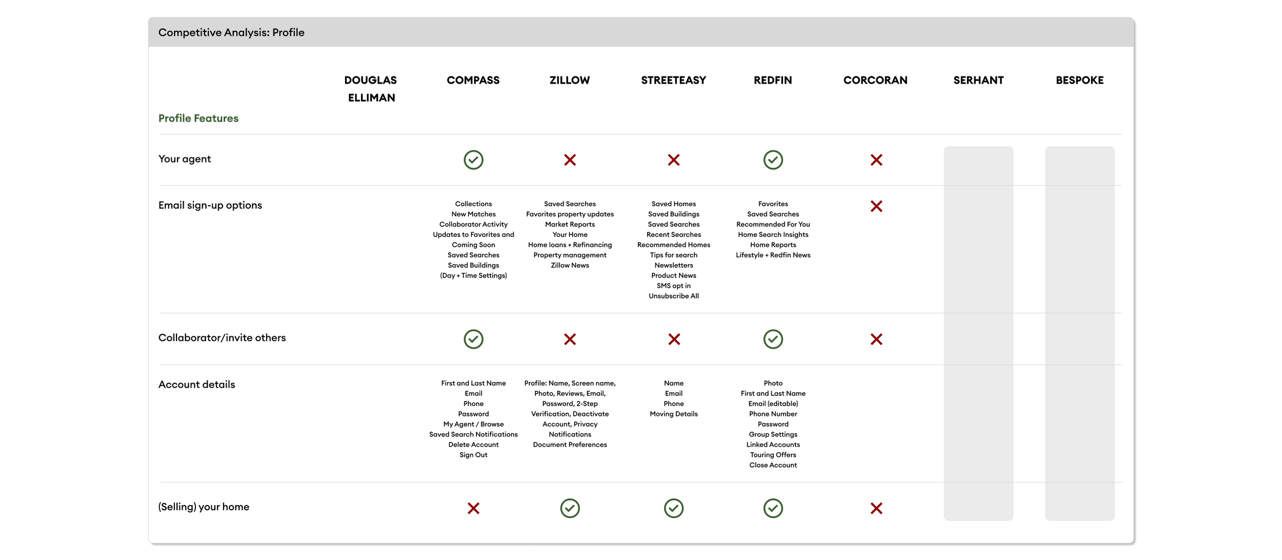
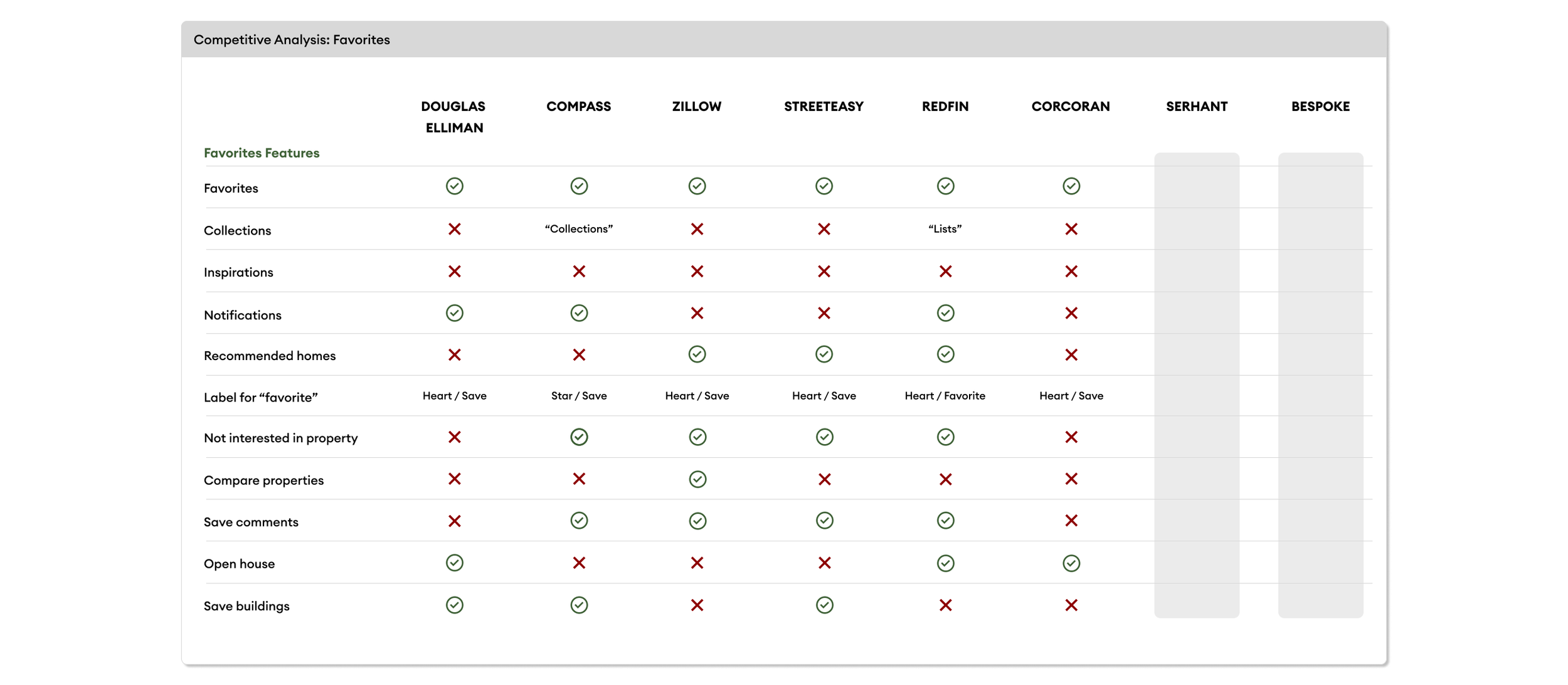
Competitive Analysis
Contextualizing the Industry
I conducted a competitive analysis to contextualize where Douglas Elliman fell within the industry of luxury real estate agencies. There is a wide range of agencies across the nation, but I chose to focus on ones that have a strong New York presence, as that is Douglas Elliman’s largest market. After identifying the competitors, I then compared their site sections, integrations, and personalized experiences.
Through this exercise, I was able to identify gaps that existed within Elliman.com.
For example:
Personalization is not being prioritized, causing the first few pages in the user journey to feel generic and irrelevant, especially with prices of promoted properties being out of reach for the average DE buyer.
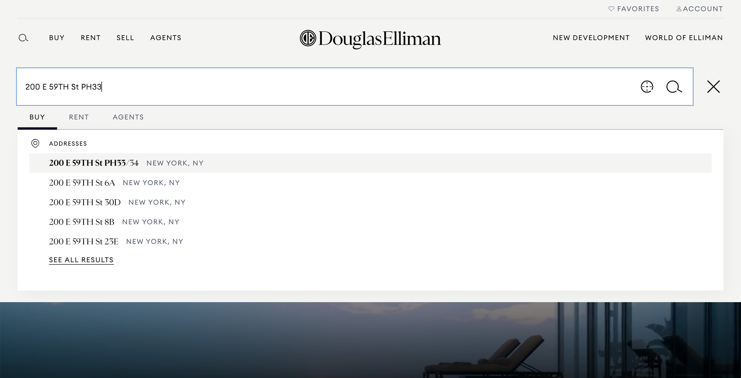
The image carousel on the listing page is difficult to use, and the ability to scan the gallery at a glance is not an option, making it less user friendly.
There is no possibility of saving properties without having an account - a high-value feature that was brought up throughout user research. In addition, there is no way to organize properties, making it difficult for users to quickly find properties they saved. This is a gap that exists throughout the industry and presents a clear opportunity for DE to differentiate itself
We revisited this analysis regularly throughout the subsequent phases of the project, using it as a guidepost when making assumptions about the industry.
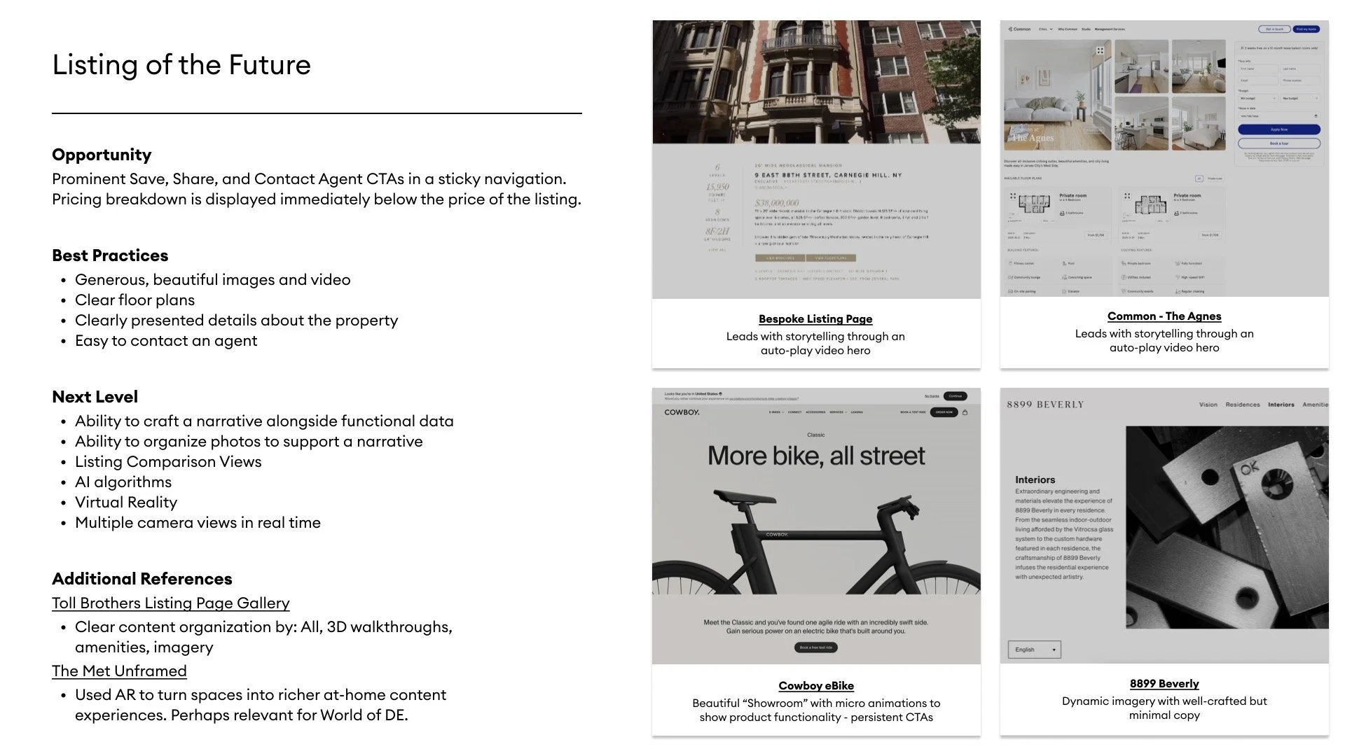
Highlighted below are a few of the sections that came out of the broader analysis.
Website Opportunities
Our Process and Considerations
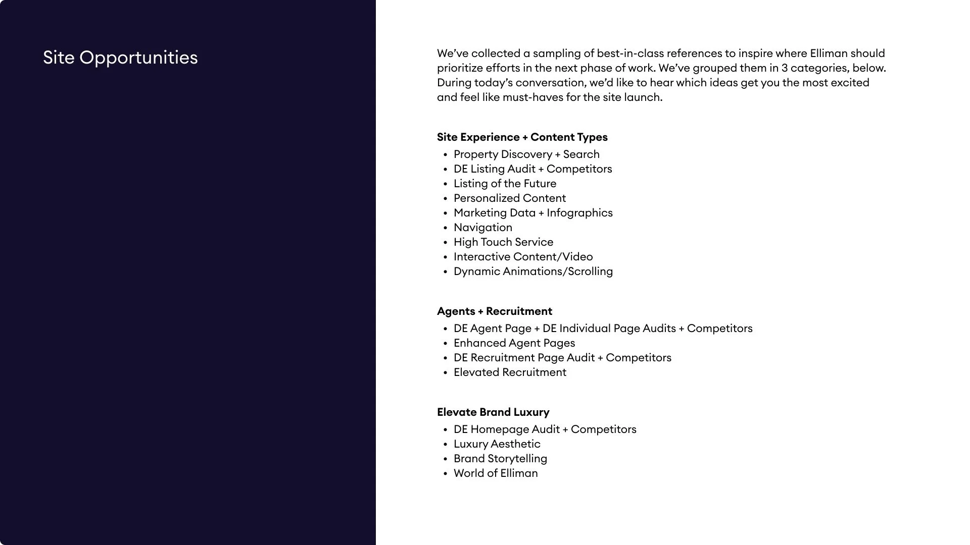
Pairing the feedback from stakeholder and user interviews with the findings from the competitive analysis, we could see some clear ways in which the website could be improved. To provide inspiration for how these opportunities could be brought to life, we aggregated sample content that represented the leading usability characteristics across the industry. This culminated in the creation of a Site Opportunities vision deck that we presented to Douglas Elliman - the first few slides of which are embedded below.

Wireframes, Visual Design & Prototypes
Section Showcase: Account
In the sections below, I outline the process that I followed for one of the tracks of work that I led: Account. This particular track was one of the most robust, and it required extensive organization and vision to successfully translate the requirements to a thoughtful UX design.
The Account section reflects the insights gleaned from the research I conducted and grounds itself in DE’s broader objective of providing an industry-leading digital experience to both buyers and sellers across a variety of markets.
Wireframes
The purpose of the My Account dashboard is to enable users to navigate their account with ease, surfacing information in an intuitive fashion that emphasizes personalization.
Considerations
After reviewing relevant dashboards both within and outside of the industry, I chose to use cards to represent sections of the account. This offers a clean way to navigate to various sections of account, and it respects users’ interest in seeing a personalized display up front rather than something that feels more generic. Furthermore, the use of cards approach allows for seamless modifications should new features and user types come up down the line.
Translating Wireframes to Visual Comps
Although I did not specifically translate the UX to UI for this section, I was able to do that for other sections of the site such as what can be seen here.
Considerations
Because we were a third of the way through the project and the brand guidelines had been largely built out, there were not many changes that we needed to make to the wireframe as it was translated to a visual comp. Most of my role at this point was supporting decisions made in the wireframes, providing details on link destinations, and explaining how desktop and mobile would differ for this section.
Prototype
Please explore the pages that were included the Account section.
More of My Work