Code42 Website Refresh
Leading information architecture and UX design for a broad site refresh focused on clarity and content structure.

About
Code42 is a cybersecurity software company that is native to the cloud and rapidly detects data loss, leak, and theft
As the technical project manager of this project, I defined website requirements with stakeholders, conducted competitive analyses, managed usability testing, drafted wireframes, and created pixel-perfect mockups.
My Role
Technical project manager
UX/UI for desktop & mobile
UX research
Timeline
15 weeks
Deliverables
User flows
Personas
User research report
Sitemap
Wireframes
Pixel-perfect designs
Tools
Adobe Illustrator
InVision
Sketch
Objective
Due to limited flexibility in the existing module library, the web content team found it challenging to provide relevant product details, showcase product imagery, and offer conversion points resulting in a poor user experience for website visitors
The scope of this project included improving the user experience on the web, restructuring the existing information architecture, and supporting the content team in building better content management systems.
Code42 uses an Atomic Design system to create website experiences. I accounted for the design and development of a set of modules, with the specific number being identified in the research and ideation stages.
Discovery
Website UX Audit Findings
As a team, we conducted a UX audit of the Code42 website, including user testing and heuristic analysis to inform improvement opportunities.
User Testing
We conducted a total of eight user test sessions to capture feedback and usability findings. The user test sessions were completed remotely via video calls with two current Code42 customers and six non-customers that matched the target customer profile.
Key Insights
Most users generally skim each website page, gravitating to large visuals, statistics, and headlines.
Page length and too much text were frequent points of feedback. One user noted that some of the pages felt “messy”, highlighting their desire to quickly scroll through the pages at a higher level, with the option to click in/dig deeper into sections and content that resonated with them.
While most users would only research the product and then present it to their managers as a next step, many felt that the contact forms required too many fields.
Heuristic Audit
This analysis was performed to uncover insights based on UX standards and best practices. Findings were categorized by the following areas:
Task Orientation
Navigation and Information Architecture
Forms and Data Entry
Layout and Visual Design
Accessibility
Key Insights
Navigation and Information Architecture:
On longer pages (of which there are many) it is often difficult to locate a primary CTA. Additionally, the header is not sticky, so you do not always have the navigation (with the primary conversion point) in front of you. This is even more of a point of friction on mobile, where scrolling takes longer.
Layout and Visual Design:
The spacing and sizing in certain modules could be adjusted to reduce the feeling of crowding.
Moving forward in the design process
Pulling inspiration into InVision
As design and research lead, I took the insights from the research we conducted to inform the design for this project. I started by aggregating examples that I thought exemplified all the best usability characteristics that we needed to implement on our site. Once I identified elements of inspiration that corresponded to each gap, I shared it with the product marketing and web content team to see if this would fulfill their content needs.
Wireframing
Low-fidelity wireframes
Based on ideas derived from the inspiration board and accompanying ideation sessions, I began designing the first set of new modules. I then moved the five drawings over to InVision to be able to better communicate the vision with my remote team and gather feedback.
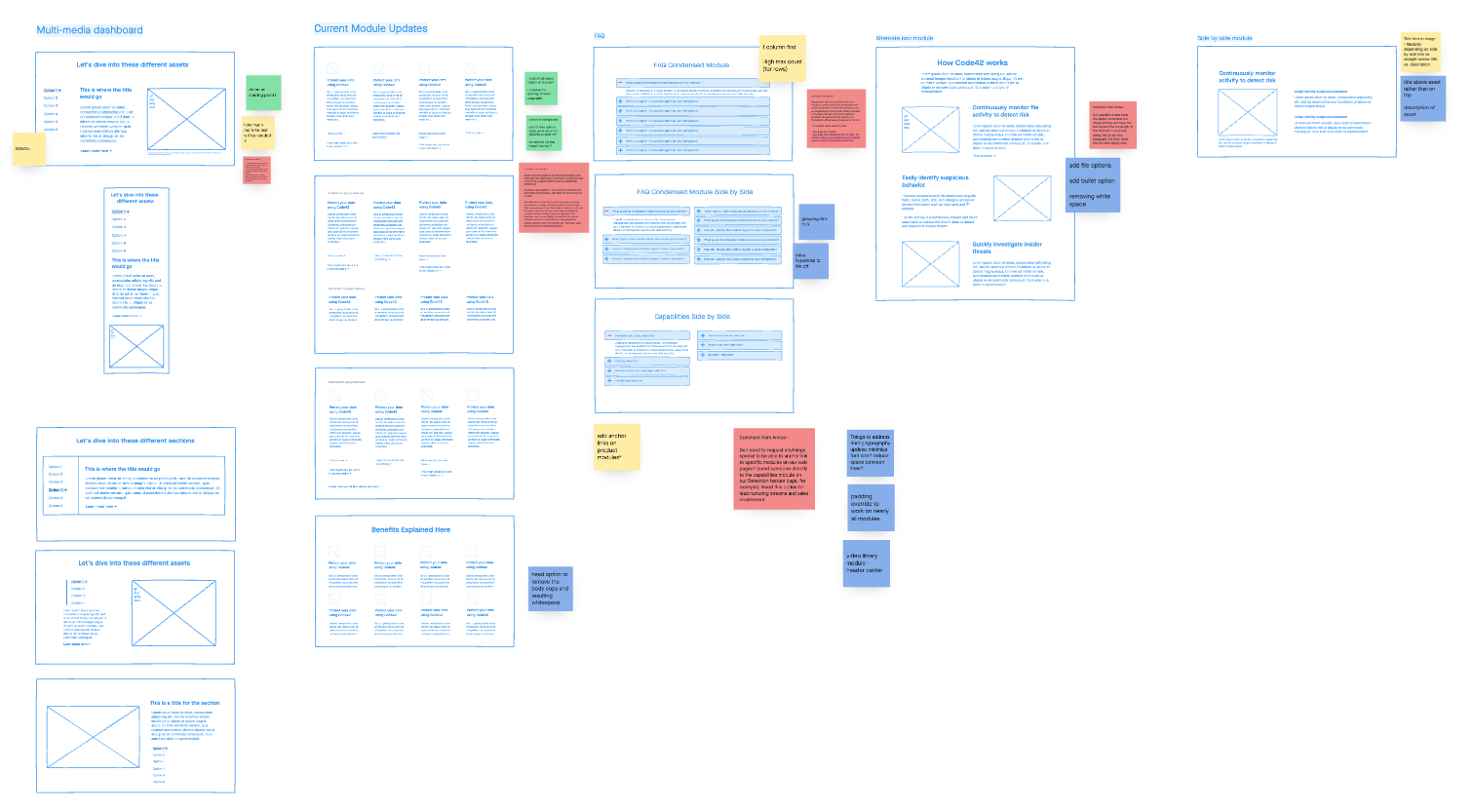
Depicted below is an example of the first round of low-fidelity mockups. There were two separate sessions dedicated to 10 more modules that ran through a series of critiques with stakeholders in development, product marketing, and product management. The color-coordinated sticky notes represent feedback, questions, and recommendations from each team.
High-level overview of the first round of low-fidelity wireframe creation and feedback
High-fidelity wireframes
After conducting review sessions for each phase of modules, I was ready to make changes to inform the high-fidelity wireframes. At this point, I also defined the specs to ensure a smooth hand-off to the development team. I left detailed notes next to each element of the UI defining the exact spacing, font style from our brand guidelines, movement, hover state, and flexibility. Additionally, I did the same for the mobile view, contemplating the order of layout and how it would change from the desktop view.
I designed pixel-perfect mockups for each module in desktop and mobile view
Wireframe to hi-fi design: multi-media dashboard
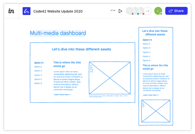
Low-fi: multi-media dashboard
The purpose of this accordion-style, tabbed module was to enable the content team to describe a higher volume of product features with accompanying technical images without causing the page length to increase dramatically.
Considerations
Image block should be able to accommodate many different file types including gif, jpeg, png, mov
Content team will need 4-6 tabs and the option of including a link to relevant documents or assets
Hi-fi: multi-media dashboard
I added Code42 branding and combined the first and second content columns to accommodate for the page margins.
Considerations
Tabs need to appear more “clickable”
Character constraints should be identified per section
Header
Subhead
Description
Specs need to be defined
Going live & results
Using an agile approach, the net-new modules and changes to the information architecture were launched over the course of the 15-week project, with most user-facing changes launching at the end of the project. Throughout that time, each of the three phases overlapped at some point in the design process, which required a very detailed project plan and excellent communication with stakeholders.
Production version
The process was iterative and required a few testing sessions with users before development. Since launching, this module has been widely used across product pages and is helpful when content managers need to identify a lot of detailed features with visual support.
What was the outcome?
The analytics below compare the two weeks post-launch with the two weeks prior to launching final changes.
Sep 14 - Sep 28, 2020 vs Aug 30 - Sep 13, 2020:
Unique pageviews increased by 21.45%, from 34,175 to 41,505
New visitors increased by 19.28%, from 16,425 to 19,591
Average session duration increased by 13%, from 1:07 to 1:21
Number of sessions increased by 2.48%, from 1:21 to 1:24
A/B testing
As the manager of a/b testing and accompanying site metrics across the site, I have conducted a series of tests related to the updates made in this project as well as other areas of the site. With the increased opportunity to add conversion points within the net-new modules created during this project, I have seen vast improvements in traffic to form pages. We conducted a holistic analysis at the end of Q1 2021 and found a 71% increase to form views sitewide and a 29% increase to form completions.


